Samsung India
A UX Case Study
GOAL
To redesign the Samsung Shop website for
- A refined product purchase journey
- Enhanced UX for discovering and comparing products
DESIGN PROCESS

HEURISTIC ANALYSIS
I conducted a heuristic evaluation to test whether the website is user friendly. The heuristic evaluation was carried out based on a set of predefined design guidelines.
Heuristic Guidelines:
- Consistency and standards
- Flexibility and efficiency of use
- Aesthetic and minimal design
- Ease of navigation
Website:
https://shop.samsung.com/in/

Home Page

Product Display Page

Shopping Cart
THE HOME PAGE - MOBILE
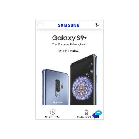
Aesthetic and Minimal Design
1. “PRE-ORDER NOW” button does not have the proper focus. It gets lost in the rest of the content and is not consistent with the button style on the desktop website
2. The menu icon, cart icon, and Samsung logo are not aligned with the center of the navigation bar
3. The customer support chat icon appears too intrusive as it overlaps with certain elements of the page
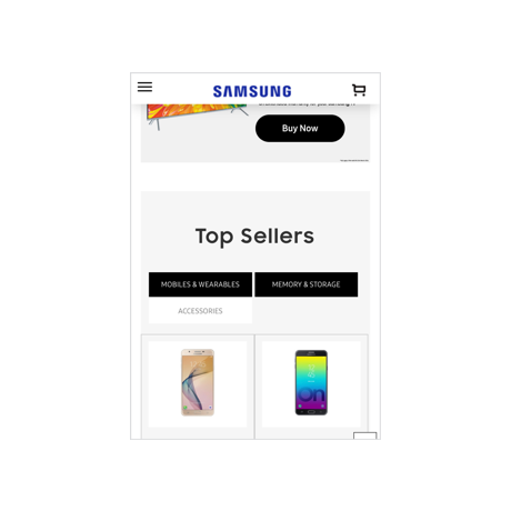
Ease of navigation
1. The three items (Mobiles & Wearables, Memory & Storage, and Accessories) are supposed to function as tabs. Instead, they look like buttons
2. Two tabs are in the selected state at the same time
3. The customer support chat icon and the button for scrolling are overlapping
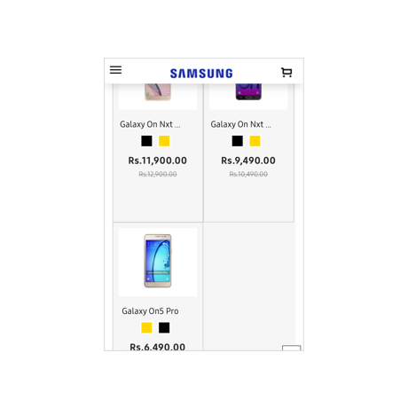
Ease of navigation
1. There is a lot of unused empty space in each product listing cell. This can be better utilized to create an efficient way of displaying products
2. Having a “Buy Now” button below each product will result in ease of purchase
THE HOME PAGE - DESKTOP
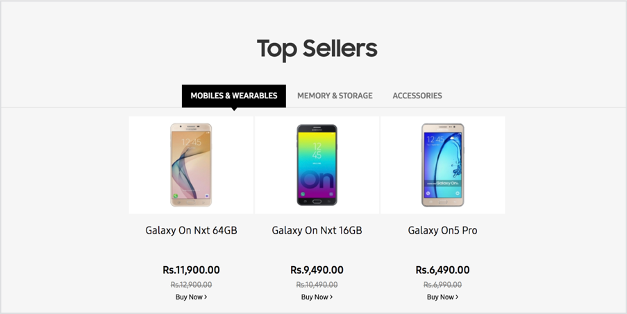
Aesthetic and minimal design
Flexibility and efficiency of use
1. All top seller products are not displayed upfront and are categorized into tabs instead. This requires 2 steps to access all top seller products
2. The visual style of the tabs (“Mobiles & Wearables”, “Memory & Storage” and “Accessories” ) gives the impression of a tooltip design
Aesthetic and minimal design
Flexibility and efficiency of use
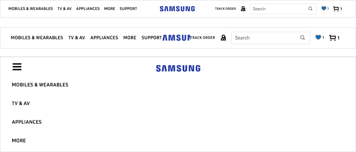
1. Icons (cart, wish list, and profile), including the Samsung logo, are pixelated. Which takes away the richness and elegance of the visual style of the website
2. Items in the header can be rearranged to optimize the space and result in a cleaner look
3. The Samsung logo gets hidden while reducing the size of the screen. The header is not optimized for responsiveness
4. On reducing the size further, the menu items are displayed in an expanded state which occupies the entire real estate of the screen. This results in a broken experience.
5. Needs a design change to address different screen sizes
PRODUCT DISPLAY PAGE - DESKTOP

Ease of navigation
Consistency and standards
1. Users process information from left to right. Hence, presenting the “Buy Now” button before (on the left side) the product information is confusing
2. Color selection option need to be presented in context with the product images
3. Color selection is highlighted as a required field when user taps “Buy Now”. This interrupts the user’s purchase flow
4. There is no indication of which image is currently selected from the product image thumbnail carousel

Aesthetic and minimal design
1. For some products, the star rating section appears clickable but it doesn’t navigate to the reviews section thus causing confusion
2. Too much clutter in the visual presentation of the information
THE SHOPPING CART

Ease of navigation
Aesthetic and minimal design
1. Information in the green notification bar on the top is redundant as the user can clearly see the contents of the cart
2. The notification bar also hides the header causing difficulty in navigation
3. The user needs to explicitly click to cancel this notification bar thus diverting his focus away from the main checkout flow
4. “Proceed to Checkout” button should have more focus compared to the “Continue Shopping”
5. Customer support chat icon overlaps the “Proceed to Checkout” button on the mobile website
Flexibility and efficiency of use
Consistency and standards
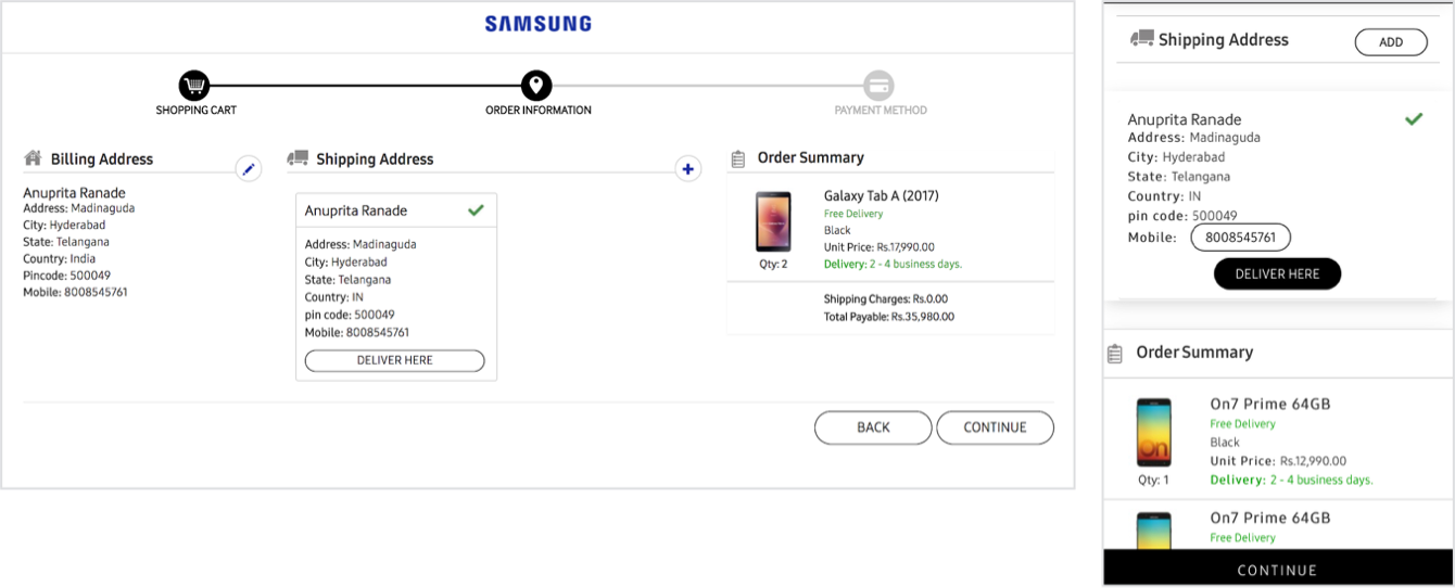
1. “Deliver Here” button does nothing. It is misleading as users would expect to proceed to the next step of clicking it
2. The “Back” button on the desktop website need not be as prominent as the “Continue” button because users should be encouraged to proceed through the checkout process
3. Mobile number is presented as a button, which is confusing
DESIGN ENHANCEMENTS - HOME PAGE
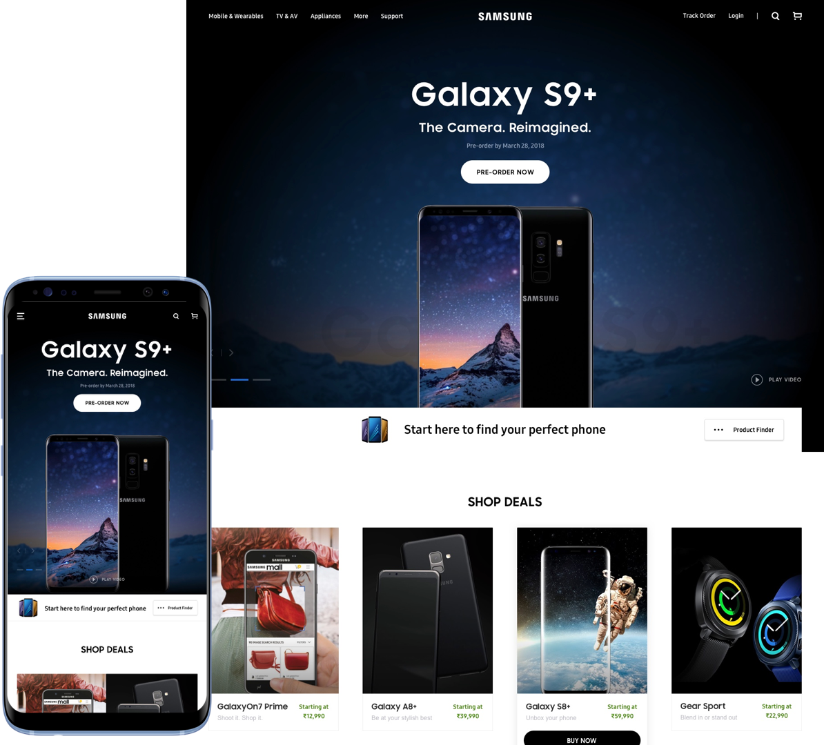
1. Minimalistic UI with a focus on core content
2. Visually appealing design for displaying offers
3. Menu items of navigation are clearly spaced out
4. Optimised for mobile screen size.
5. Clean, minimal, and sticky navigation bar
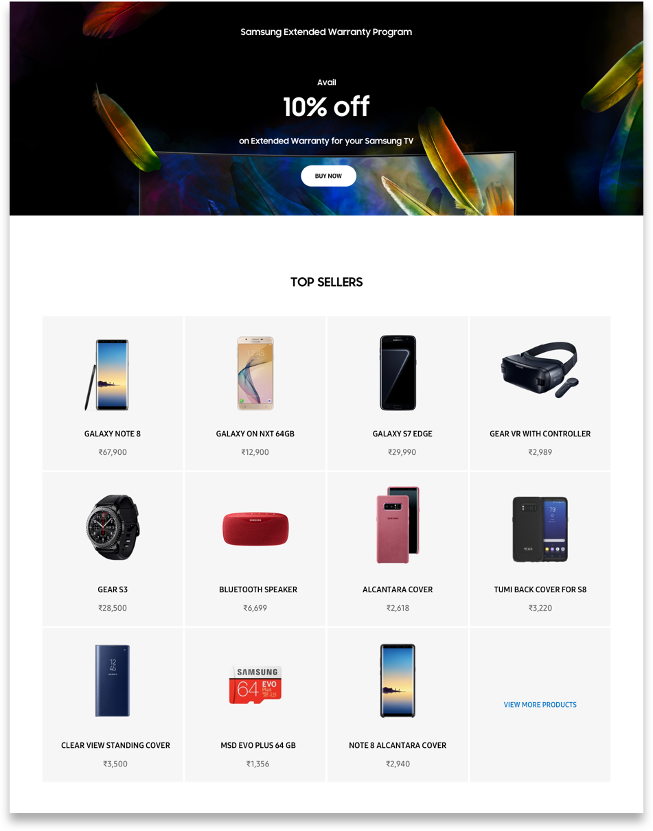
1. All the top seller products are displayed upfront
2. Users do not need to click on any category tab to view its top-selling products
3. Ability to view a list of all the top selling products is just one click away (the last box of the grid with “view more products”
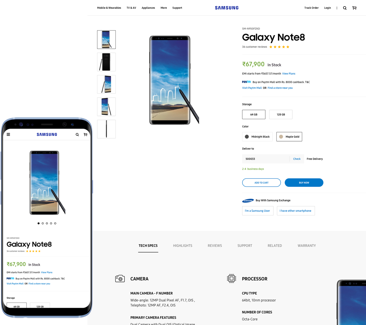
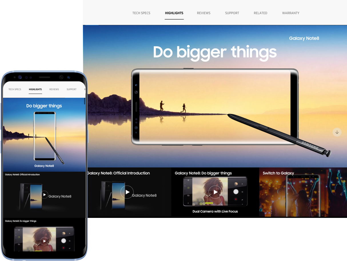
1. Clean and minimal UI
2. Clear and concise presentation of product information
3. Optimised for mobile screen size
4. All the product information is organized into easy-access tabs
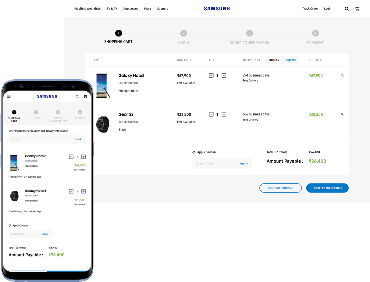
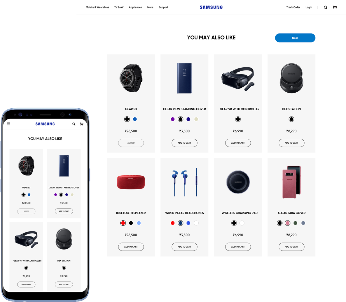
1. Allow the user to focus on the purchase of the main product from the product details page
2. Display any complementary products (up-sell) one step prior to entering the checkout process
Anuprita Ranade